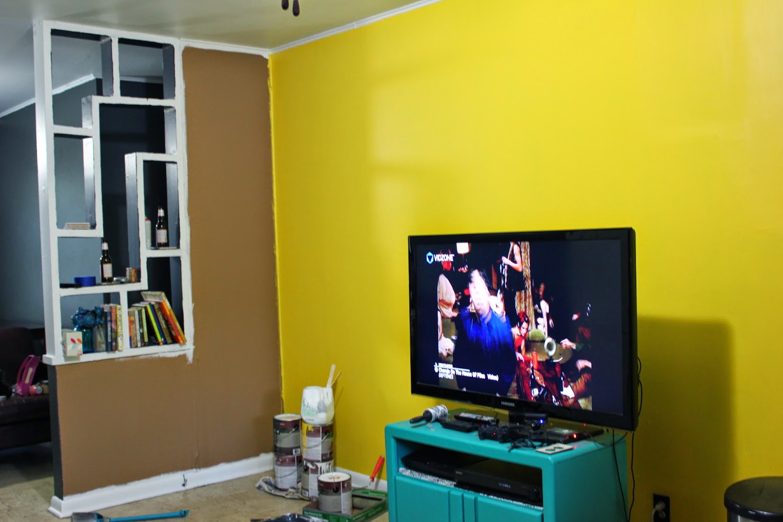
We wanted something darker and more natural than the orangey color it was before with darker brown trim. After we finished painting it we were only HoHum about it. We didn't mind the brown too much, but the trim we picked ended up looking nothing like the swatch. It looked more like a poopy brown/green.
We lived with it for a while but after I spent some time on Pinterest and Polyvore I came to John and suggested we paint the living room again but this time gray and yellow.
This is actually the collage on Polyvore I ended up creating. The table, sugar skull decal, and key rack were items we already own. The couch was one we wanted.
John was all for it because he loves lame, boring, earthy colors. So we went to Home Depot and bought our colors.
 |
| As you can see, your computer monitor plays mad tricks on your colors. |
First, we painted the accent wall. Which sucked because it took a whole gallon! The original tan we chose was so dark it needed like 4 coats of paint and we even bought the paint and primer in one. We probably should have bought a true primer though.
 |
| Yes that yellow is English Daisy. |
Painting that yellow wall was such a hassle. John did most of the work though. I was kind of scared that it would take a lot of gray to cover up the other walls so we put off actually starting on them.
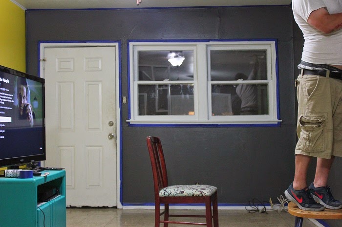
Then one day I came home from work and John had painted the ceiling and all the trim white! Then the next day he painted the dining room walls.
So with my two days off we decided to tackle the living room and clean everything.
 |
| Yes, we're watching Buffy. |
 |
| It may look like he's doing all the work but...he is. |
We decided to leave the shelves off the wall in the dining room to open it up.
 |
| Don't mind the fingerprints. |
We also went to Ikea a few weeks ago and happened, on a whim, to both fall in love with a TV stand. The same TV stand might I add! So we put it together, rolled away my old one, and set the whole thing up.
 |
| With Noah, we have to dust everyday. |
Then, since we were finally done painting John was able to put up the sugar skull decal we'd had.
We both love it. Even though the color is dark (more of a bluey/slate gray), the white trim and ceiling really brightens up and enlarges the space. Everything looks so clean and sleek -- it's awesome. We're still not quite done though. We would like a floor lamp and a (real) bookcase for books and DVDs.
Here is what the dining room looked like when we moved in, when we painted the first time, and what it looks like now.


No comments:
Post a Comment